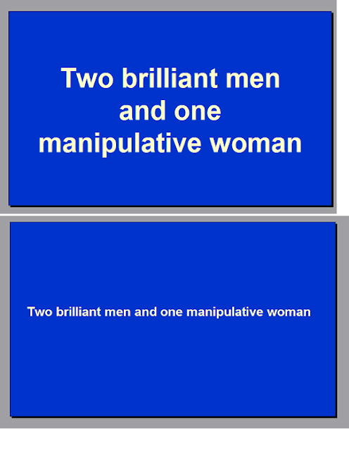
We talked about choosing the right words for your book
trailer. An equally important aspect is the display of the words.
1. Size and font
I would generally avoid overly large font sizes that result
in multiple lines. For example, compare
Unless you make the second screen too small to read,
generally speaking the first example takes more effort to read. I personally
hate having to generate multiple visual saccadic movements within a short time
(I study neuroscience).
About choosing the right font. You could follow the
guidelines of choosing the font for your book cover. For example, you certainly
shouldn’t use an elegant font for a horror, unless you intend to create the
contrast and it works. In general, I would stick to simple and clean fonts like
Arial for the ease of visualization. The best font is the one that the audience
doesn’t notice what font is being used.
2. Pacing
When you write the book, pacing is manipulated by choosing
the desired sentence lengths, adding or omitting descriptions/actions. You
can’t control how fast the reader physically reads each word. With a video, you
have a lot more control, and you should take advantage of it. Without hindering
readability, you could customize the appearance of each word/clause/sentence,
rather than setting up a fixed pace for the whole presentation. When done well,
it can help achieve great effects. The book trailer for INTO THE VAST is one of
my favorites, even though it doesn’t have fancy images.
In the first half, the words appear at a slow pace, building
up fear and an eerie feeling. It speeds up during the second half when it
introduces actions. The music is also a great help, but let’s talk about that
later.
Rule #3. Don’t make the audience work too hard. If you
choose to build a slideshow typed trailer with a set of photos, I would say,
try to limit the number of photos and have words on each photo. Why? Let me
give you an example. Say you have three photos. The first one shows a plate of
fruit. The second one shows a dog sitting in front of a house. The third shows
a woman looking at a mirror. This will make the audience wonder what message
you are trying to convey here. Is the woman afraid of getting old or fat, so
she eats healthy food? Does the dog at the door resemble her longing for a
visit from someone? In fact, all you want to show is an ordinary housewife’s
life. So do not leave your audience wondering. You are not making a full-length
movie here. You are advertising for your book. Tell them explicitly what you
want to say.
To be continued...
To be continued...

No comments:
Post a Comment
Comments highly appreciated! - Fiona